Six Keys to Avoiding Wedding Day Color Mistakes
Six Keys to Avoiding Wedding Day Color Mistakes
It’s not the biggest decision you’ll make in wedding planning, you’ve already said yes… but, picking colors is near the top!

Ribbons of multiple colors with similar hues hung for the ceremony backdrop make the couples neutral colors stand out beautifully.
Deciding on a color palette is a pivotal step which will influence all aspects of your wedding. You’ll be eating, breathing, living these colors for the months of wedding planning, and for the years afterwards as you enjoy your wedding photos.
How can you make color decisions confidently, so your choices stand the test of the time, please the eye (yours and most of your guests, anyway), and contribute to a cohesive reflection of your personal aesthetic?
We’ve listed a few common mistakes, and their remedies. As you consider your color choices, let these tips guide you.
Mistake: Not communicating colors accurately
Remedy: Collect and share swatches. One person’s lilac is another person’s lavender; one person’s fuchsia is another person’s magenta. Eliminate the ambiguity by collecting swatches from magazines and paint stores. Viewing palettes for home decor as well as weddings can help you nail down your shades, and identifying the Pantone color will be helpful for graphic artists, and even some cake decorators.
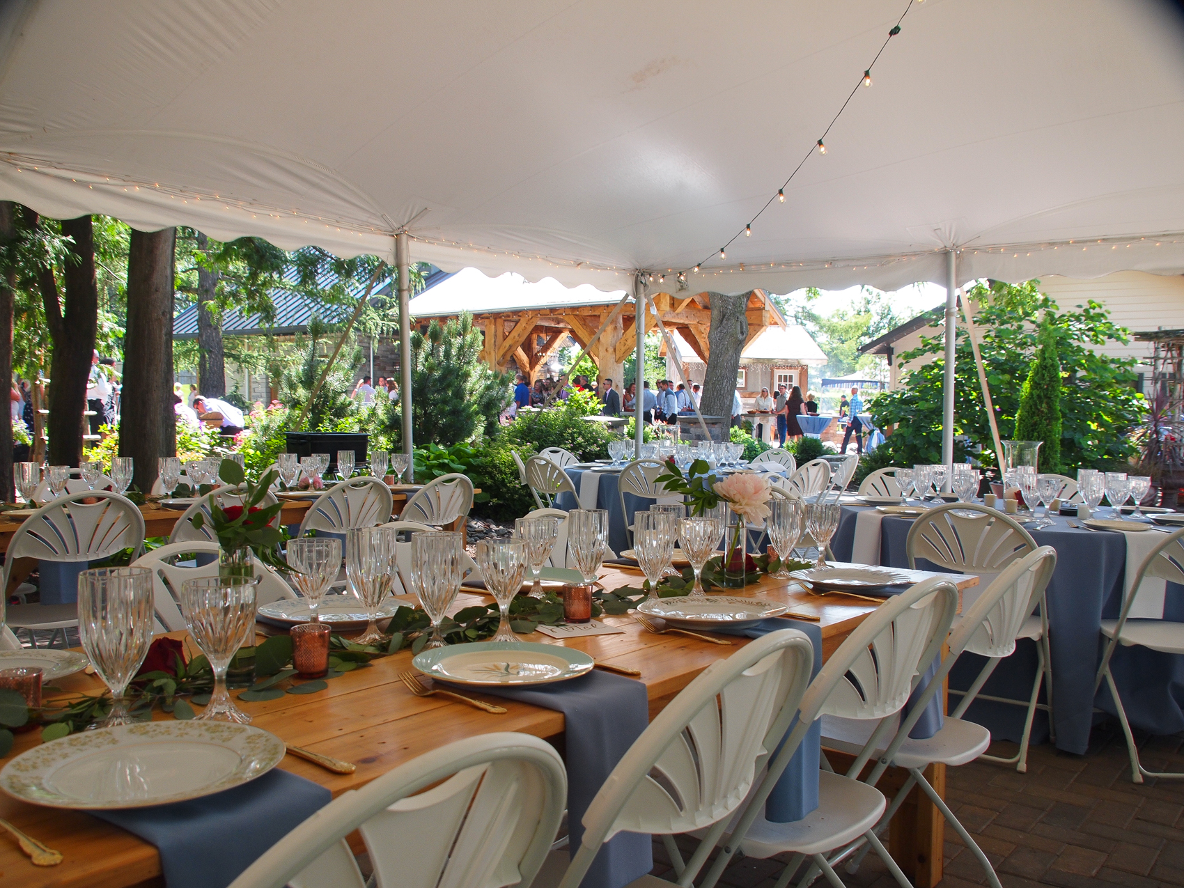
Mistake: Overlooking the venue colors
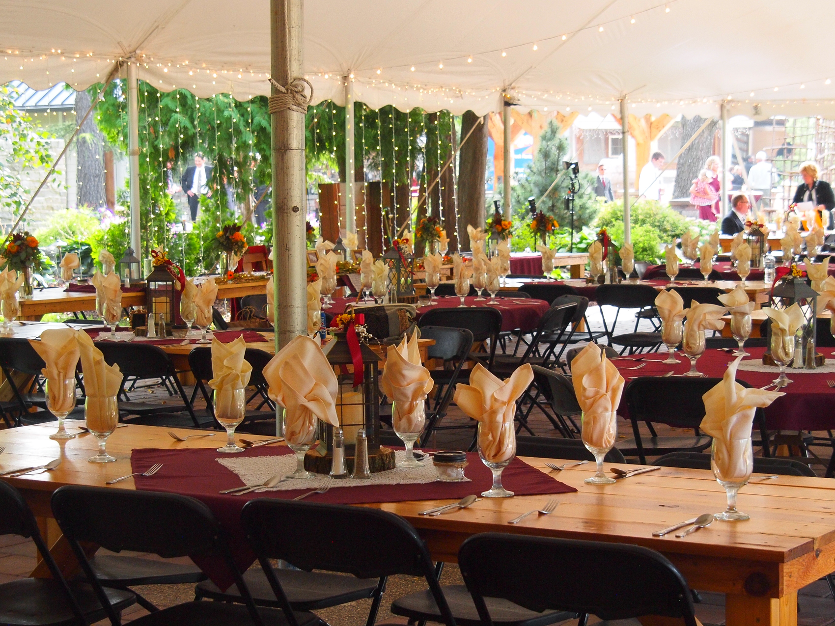
Especially for outdoor wedding venues the color of the venue play a big role in choosing your colors.
Remedy: Choose a priority. While most venues generally make an effort to be neutral, they’ll still have a palette which will inform the look of your wedding. If you’re absolutely committed to a color selection, make sure you choose a venue where that selection will shine. Alternately, if you’ve found a venue you love, let its palette inform your own. Perhaps your heart was set on a deep, true purple but the venue is dominated by dark woods and dark colors. Maybe you need to shift to a dusty lilac. Or you may have found a historic ballroom with pastel yellow walls: your vivid orange might need to shift to coral.
Mistake: Overdoing it with too many colors
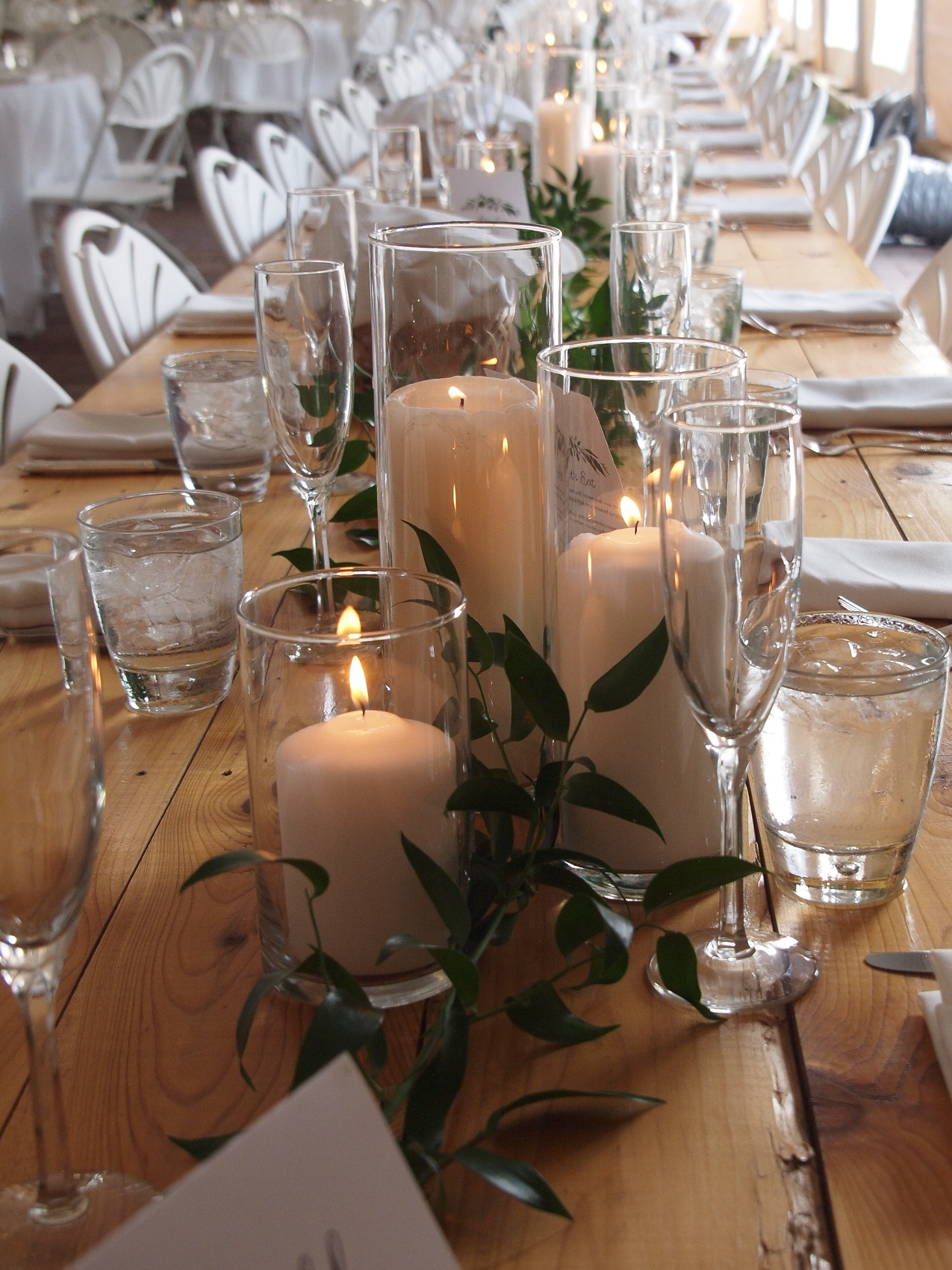
Simple and clean will make the subtlest color pop.
Remedy: Narrow it down. A simple palette is more striking. You can choose a single color for a bold statement, like pure white or lush lilac. More likely, you’ll want two, three or even four colors. Choose one as the predominant color, and the others will serve as accents. By sticking to your selection, you’ll get a cohesive, unified look. If that feels a little too rigid or formal, you can vary shades of the same color for more depth and variety.
Mistake: Embracing a two-color limit
Remedy: Loosen up! The strict two-color palette used to be de rigueur, and like many rules, there’s a time to break it. When colors really work together, you can embrace up to five of them with success. How to make a bigger palette work? Include two neutrals to keep it grounded, like brown and cream or gray and white. Embracing a bigger palette helps pull off a more thematic expression, echoing an English country garden or a winter ice palace.
Mistake: Competing colors
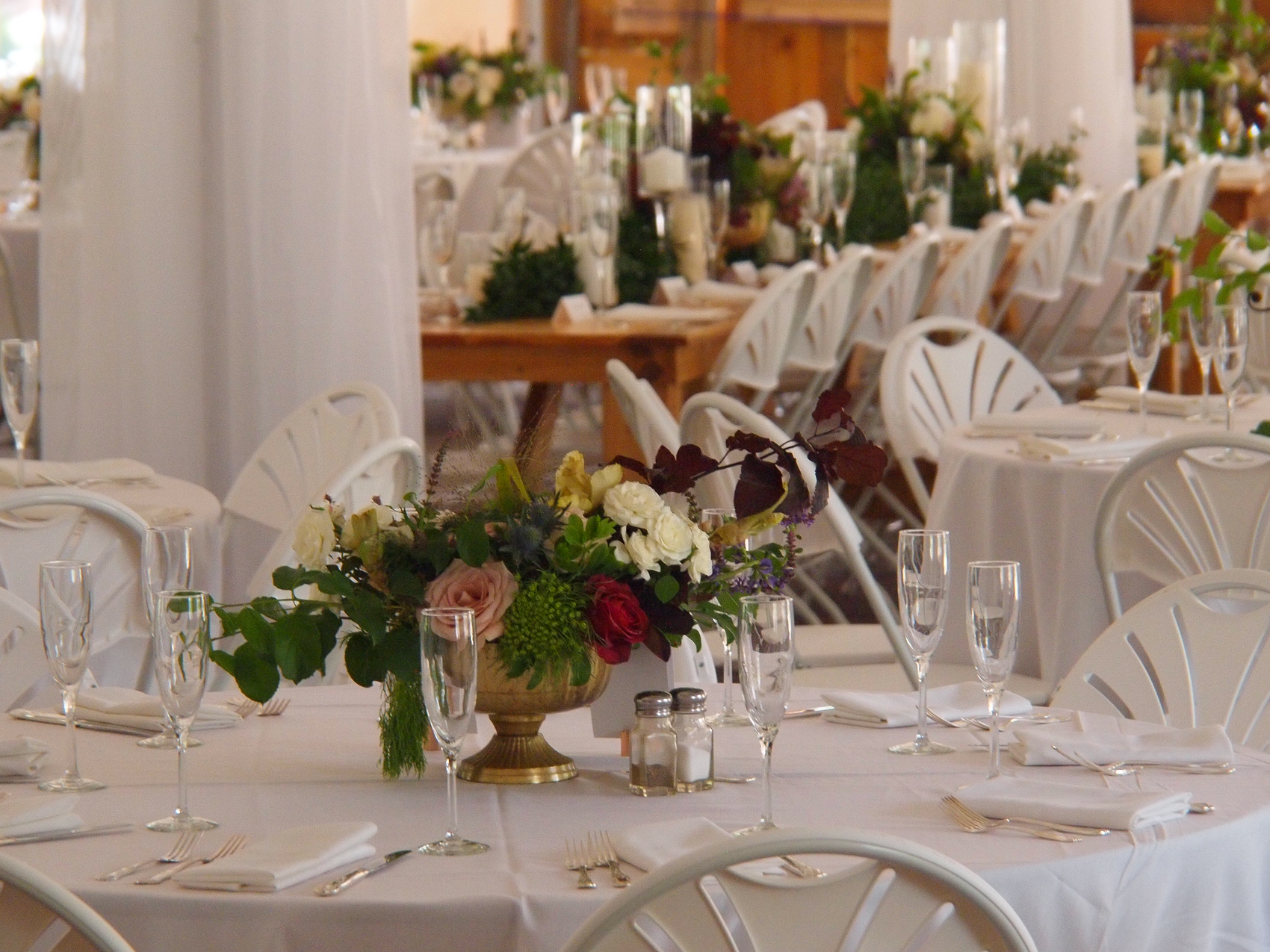
The flowers. Let your use of color dictate what you want your guests to notice.
Remedy: Choose one to dominate. When you choose your colors, select one to seize the stage. If your focal color is bright, the secondary colors should be muted. If your focal color is muted, you can have one, possibly two, bright supporting colors. Contrast in tone is essential to give the eye a chance to rest, and to ensure your decor is pleasing, not distracting.
Mistake: Neglecting texture
Remedy: Capitalize on texture similarities or differences. First, you can mix textures in a single hue for drama and depth. A thoughtful blend of shiny, matte, and woven-in texture like stripes or jacquard can be understated yet beautiful. You can also consider stripes or florals to express your color theme without being overwhelming. Make sure the textures make sense together: typically you wouldn’t combine burlap with satin, or seersucker with metallic, because they speak to different aesthetic themes.
Don’t under estimate the colors of the venue, especially outdoor/garden venues. Spring, summer, winter or fall… the season will impact the look and feel of any color you choose. The Gardens of Castle Rock helps with colors by capturing thousands of images and sharing them organized by the month of the year. The greens of spring are much different than the greens of summer. Contact an event coordinator as The Gardens to begin planning the most beautiful wedding ever… yours!! Email us at info@thegardensofcastlerock.com or call us at 651-264-9510